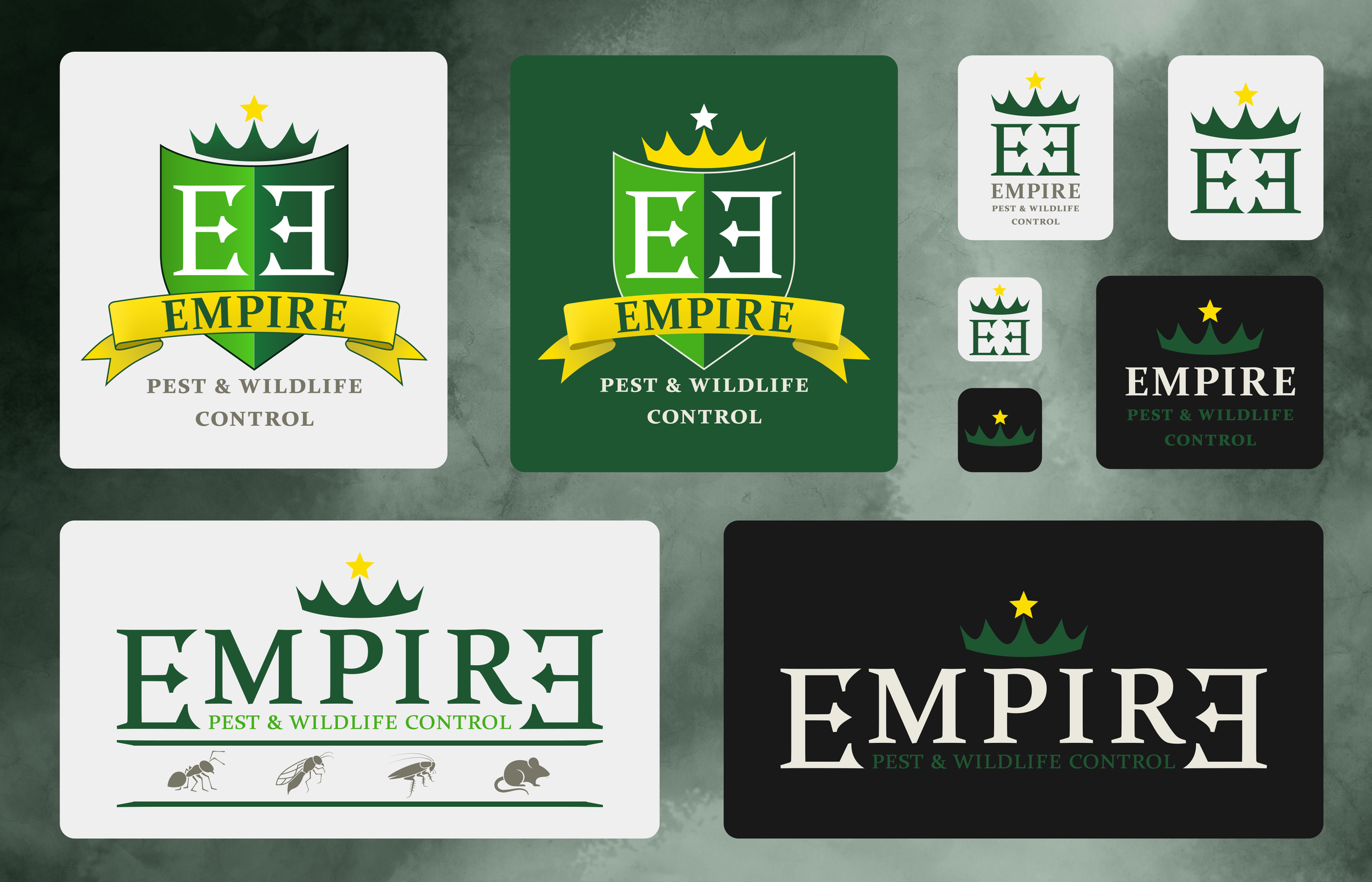
Empire Pest and Wildlife Control
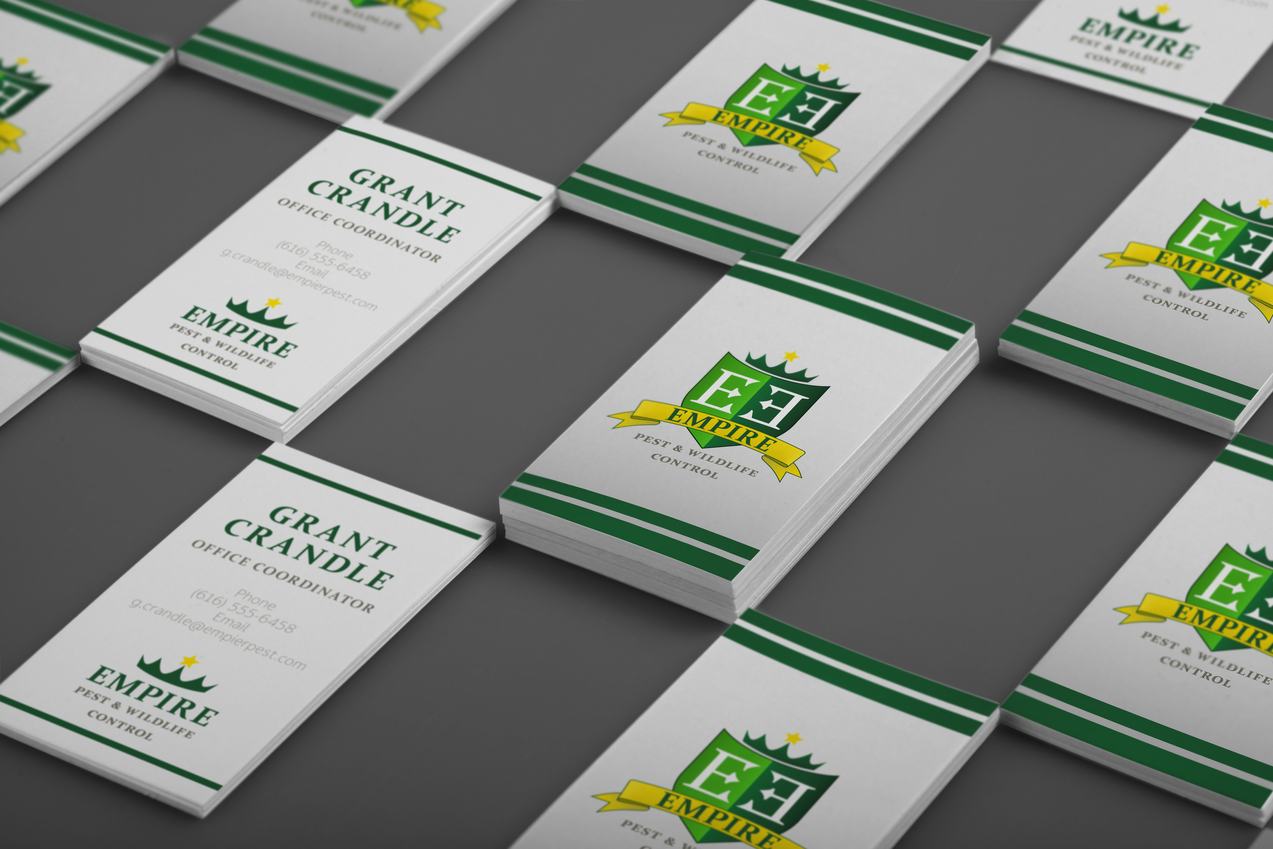
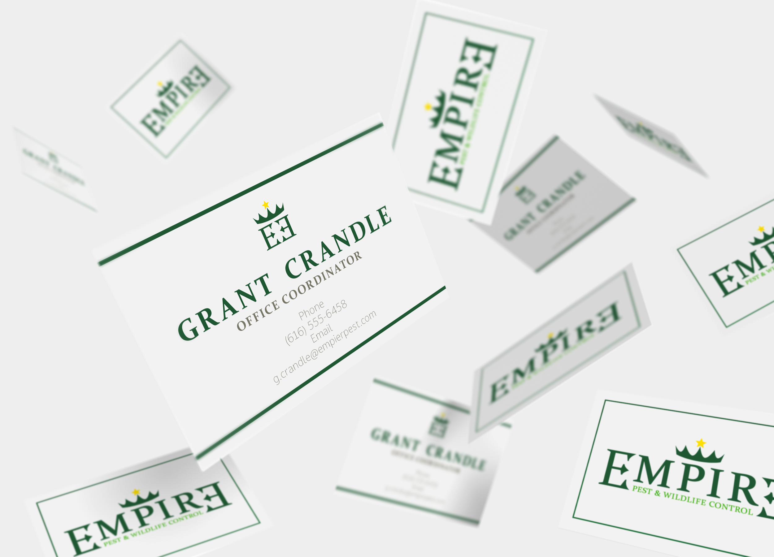
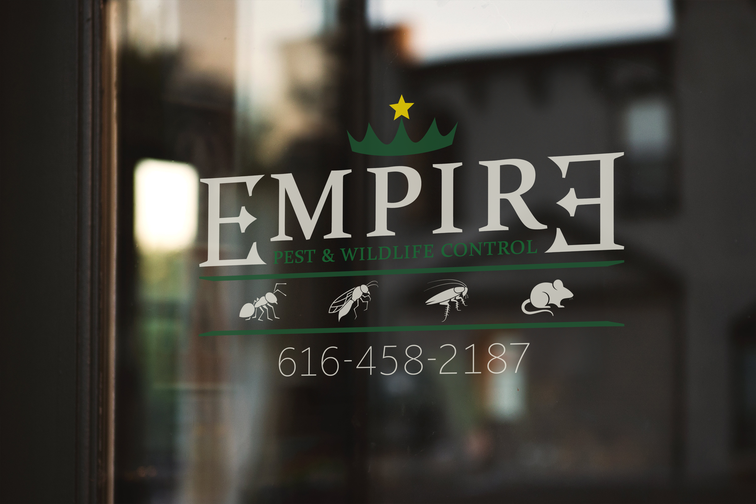
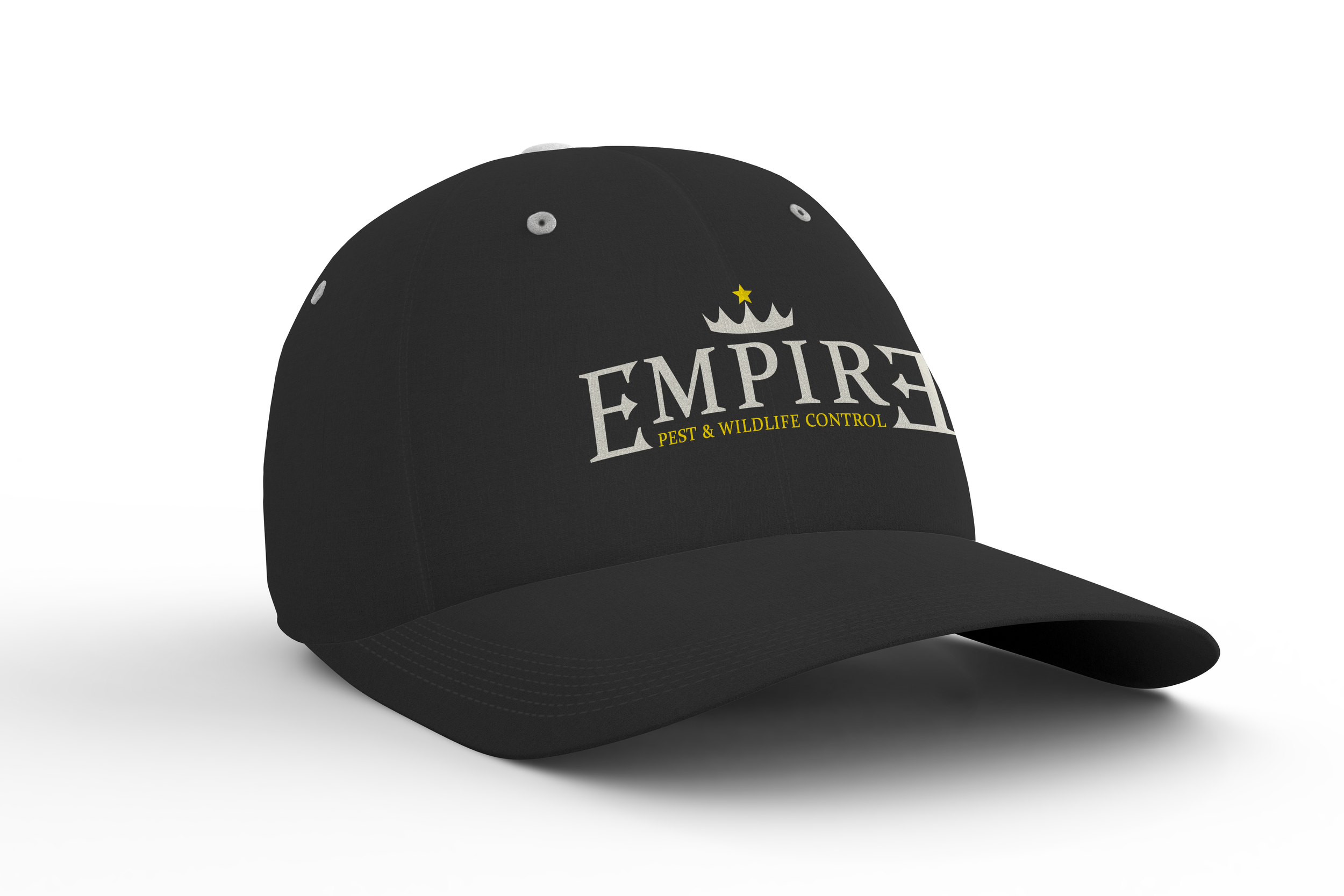
I was impressed with this company's online branding and emblem. However, the text of their name on the website seemed a bit unbalanced, as you can see in the comparison. This also presented a challenge to create pest icons, which are not my area of expertise. I decided to recreate the shield emblem, first without icons, and then a version where they could be incorporated. The word "Empire" inspired me; while not a palindrome, reversing the final "E" could create a cage or trap, enhancing brand identity without sacrificing readability.
