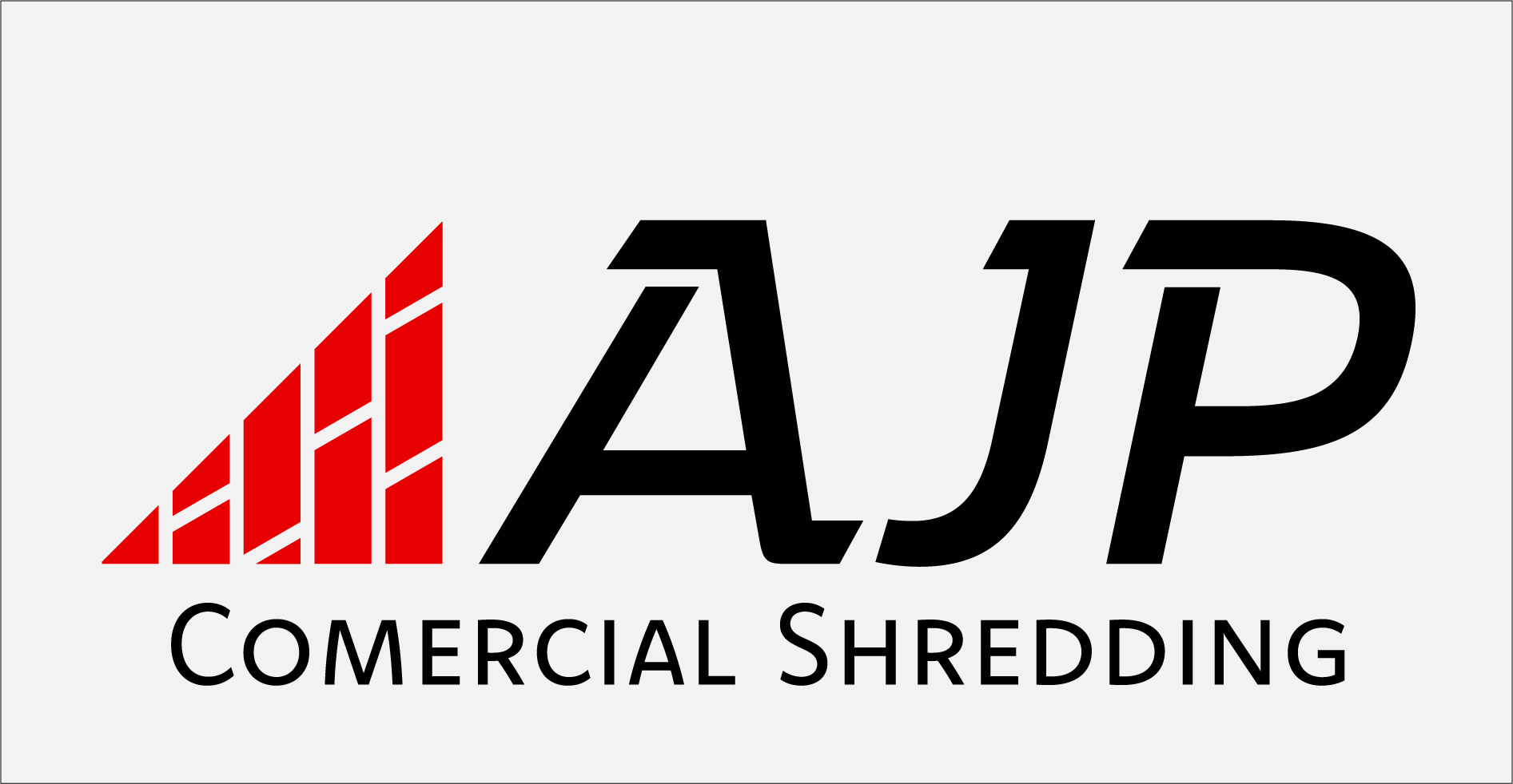
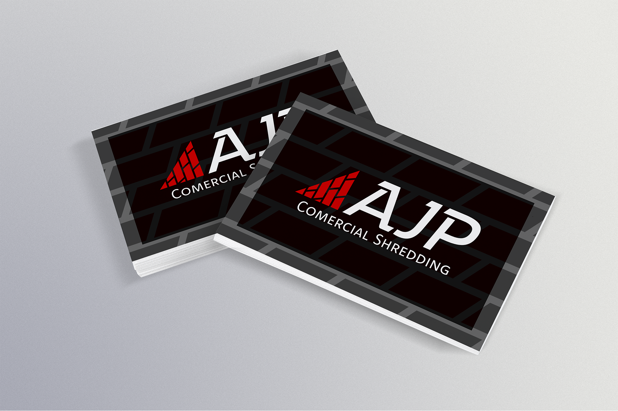
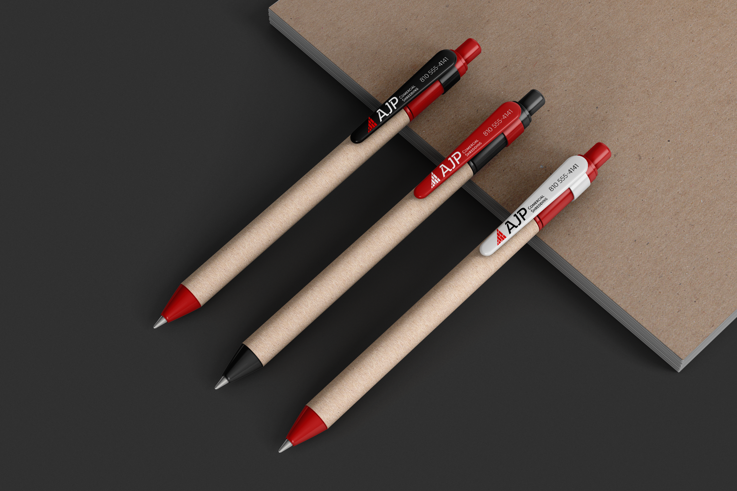
AJP Shredding
This project centered on the creation of a comprehensive logo and brand identity for a local company that, prior to this initiative, operated without a defined visual representation. The core of the design lies in the strategic incorporation of a triangle shape, carefully chosen to elegantly complement the "A" form, thereby fostering a strong sense of unity and visual coherence between the icon and the accompanying textual elements. To further enhance the design and add a layer of visual texture, a meticulously crafted shredded paper pattern was seamlessly integrated, serving to introduce an element of dynamic visual interest and distinctiveness to the overall brand aesthetic.