Taste of Heaven
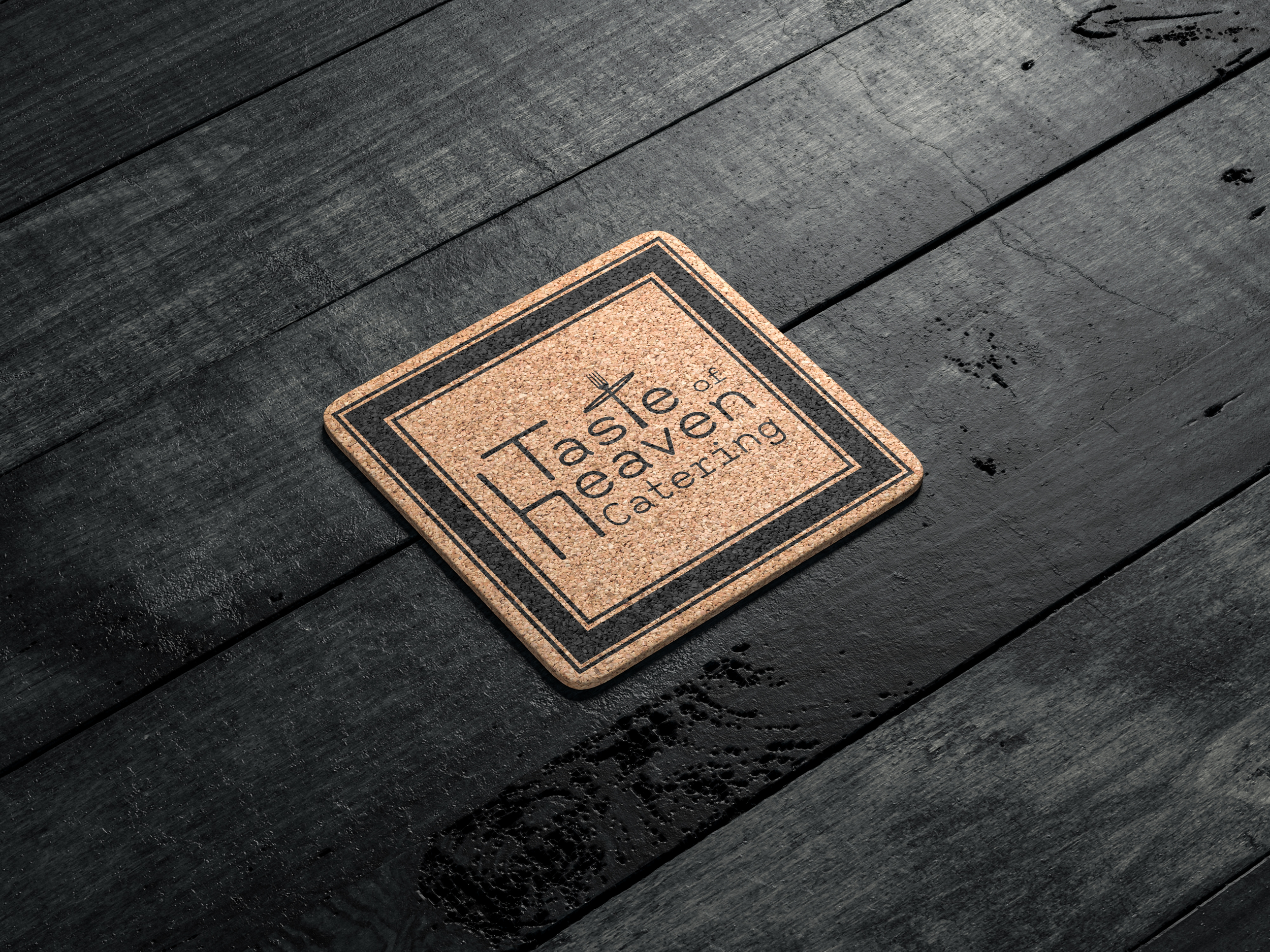
This was a logo redesign for a catering company that was using only a serif typeface without any formatting or individual touches. As a catering brand, I felt standing out would be more effective than the common, ultra-posh serif badges used by many wedding and venue caterers. I realized the "T" and "H" could be reimagined as a table and chair, combined with a halo and fork to create an emblem in the shape of a "t". This design works well in both the wordmark and as a standalone icon, given the name starts with "T".