Northgate
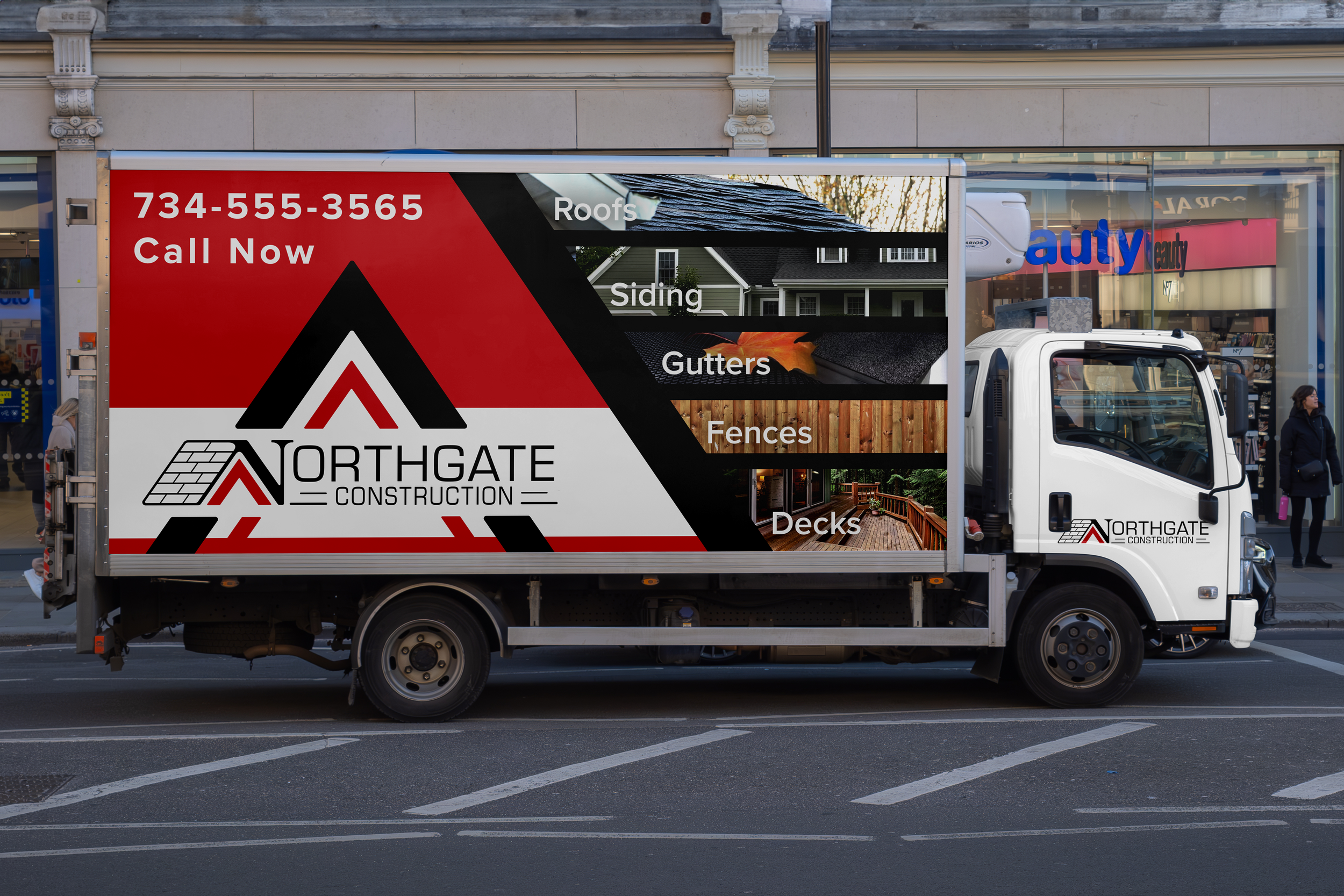
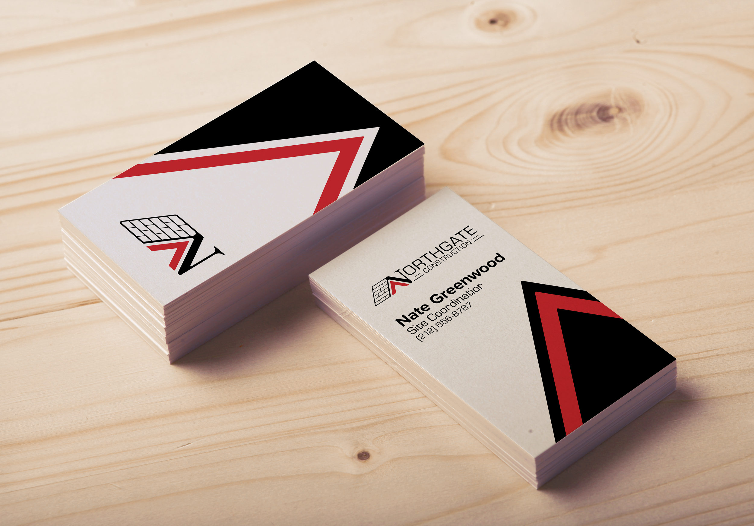
This logo redesign project for a construction company addressed a perceived mismatch between the existing logo and the company's marketing materials. While the current logo was functional, it lacked the boldness and modern aesthetic of the website and marketing, which featured a sans-serif typeface and red accents. The new logo was designed to align with this strong style, incorporating the company's roofing focus. A connection to the previous logo was maintained through a stylized serif "N," evoking the north marker on a compass rose.