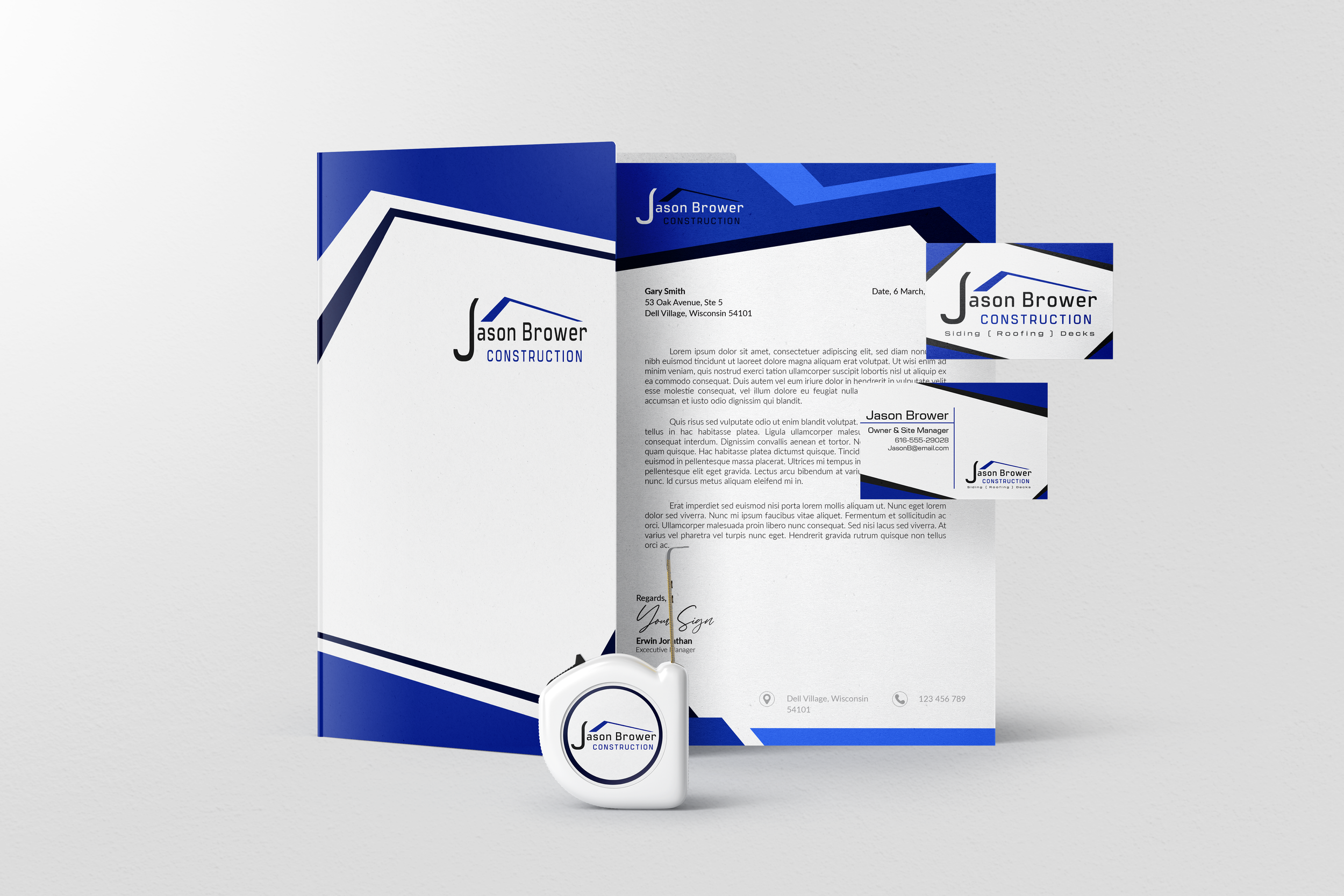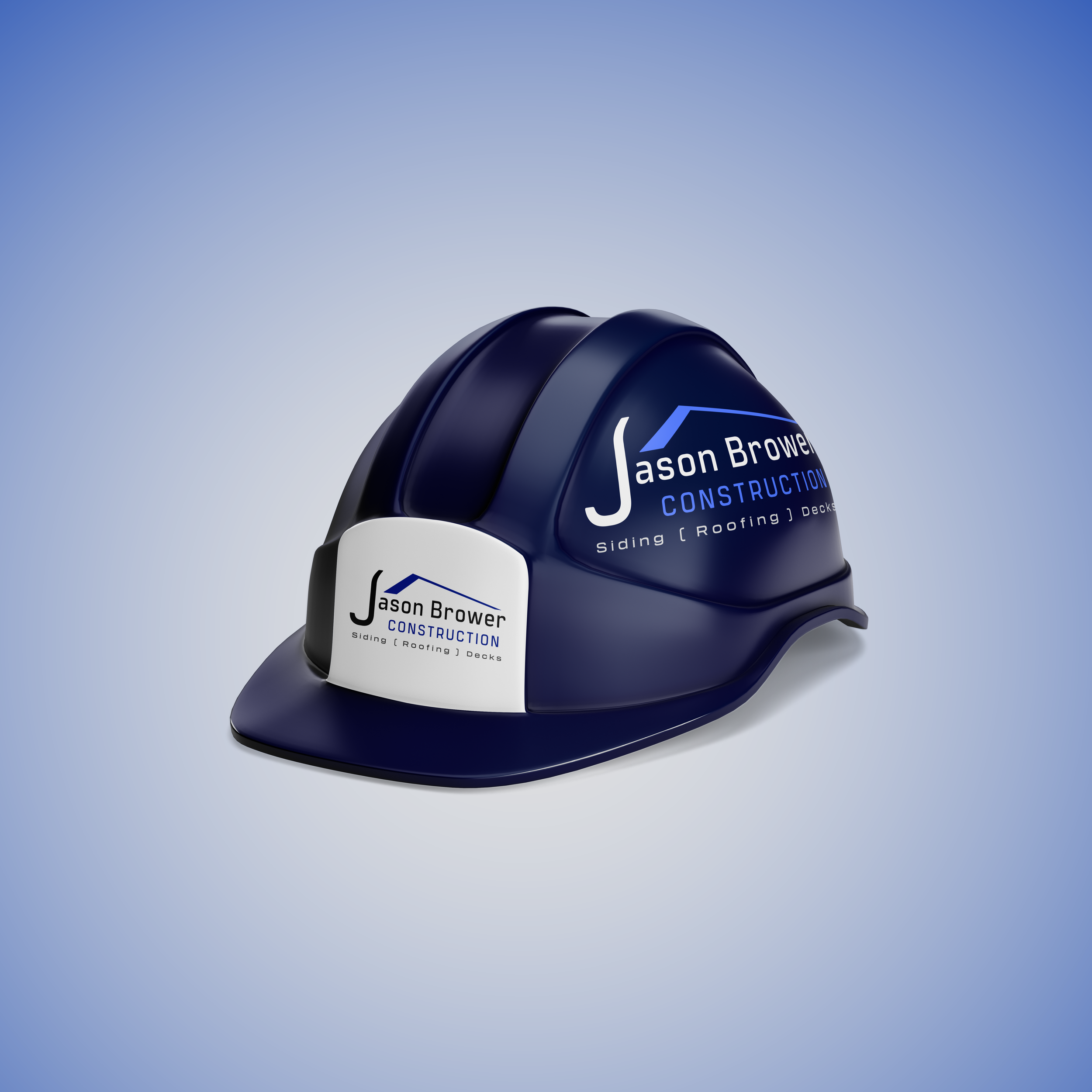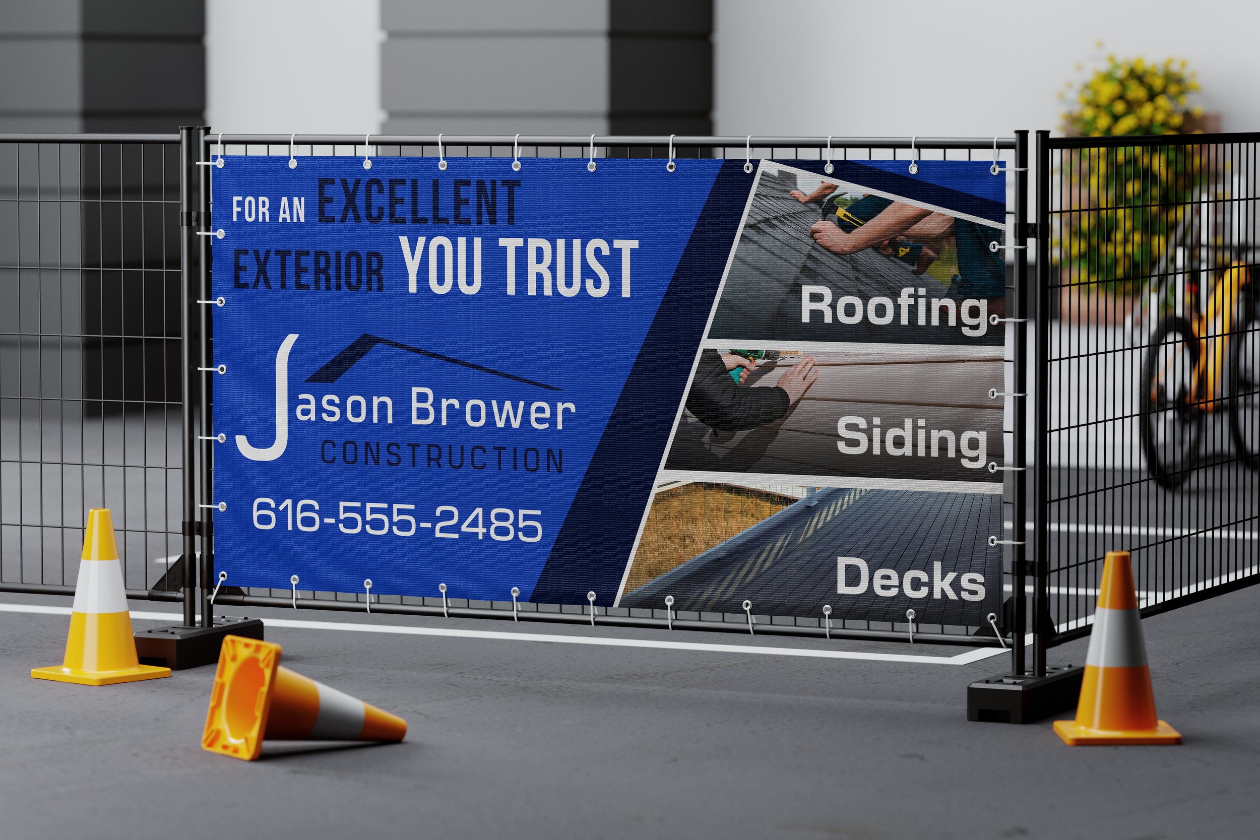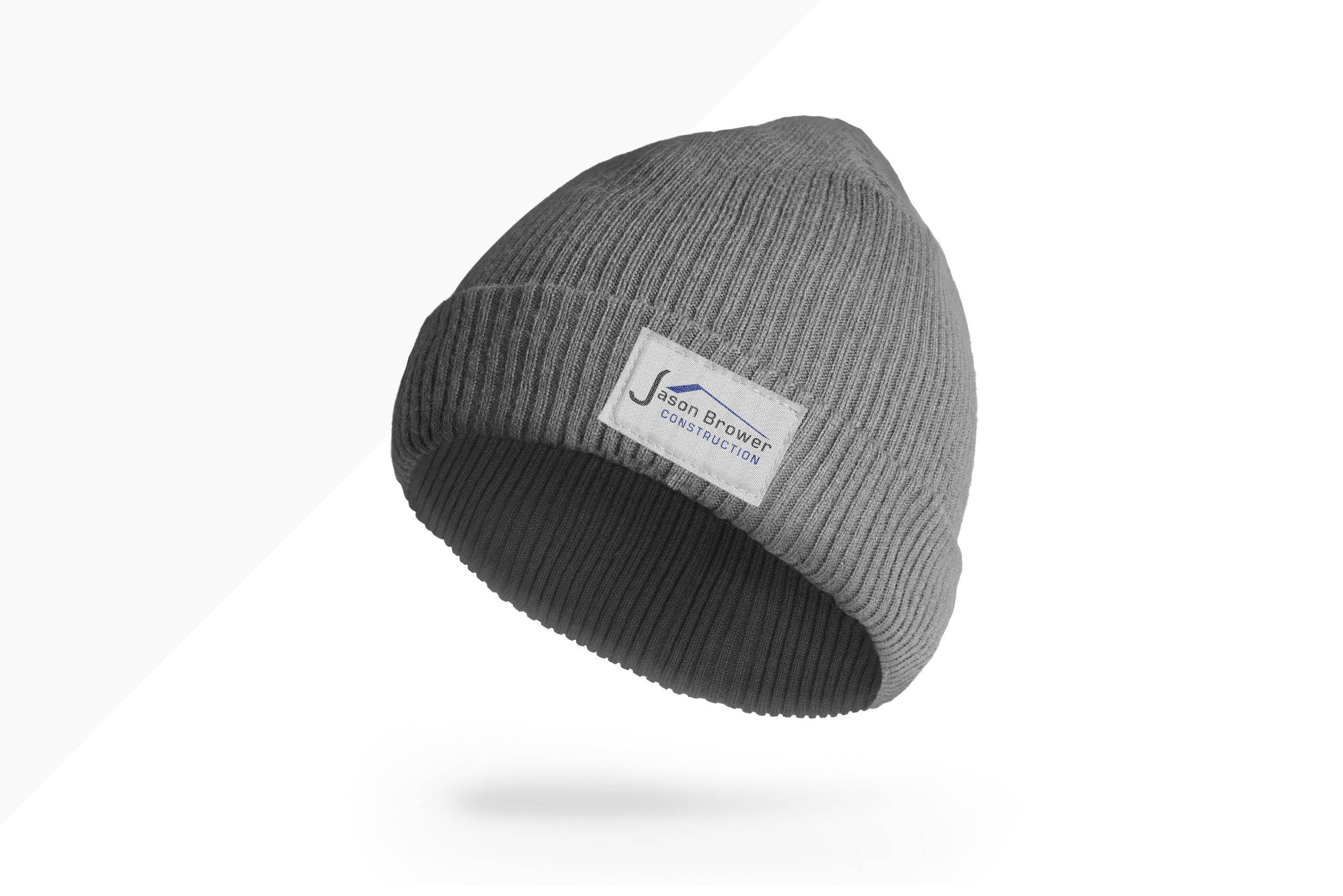
Jason Brower
Construction LLC
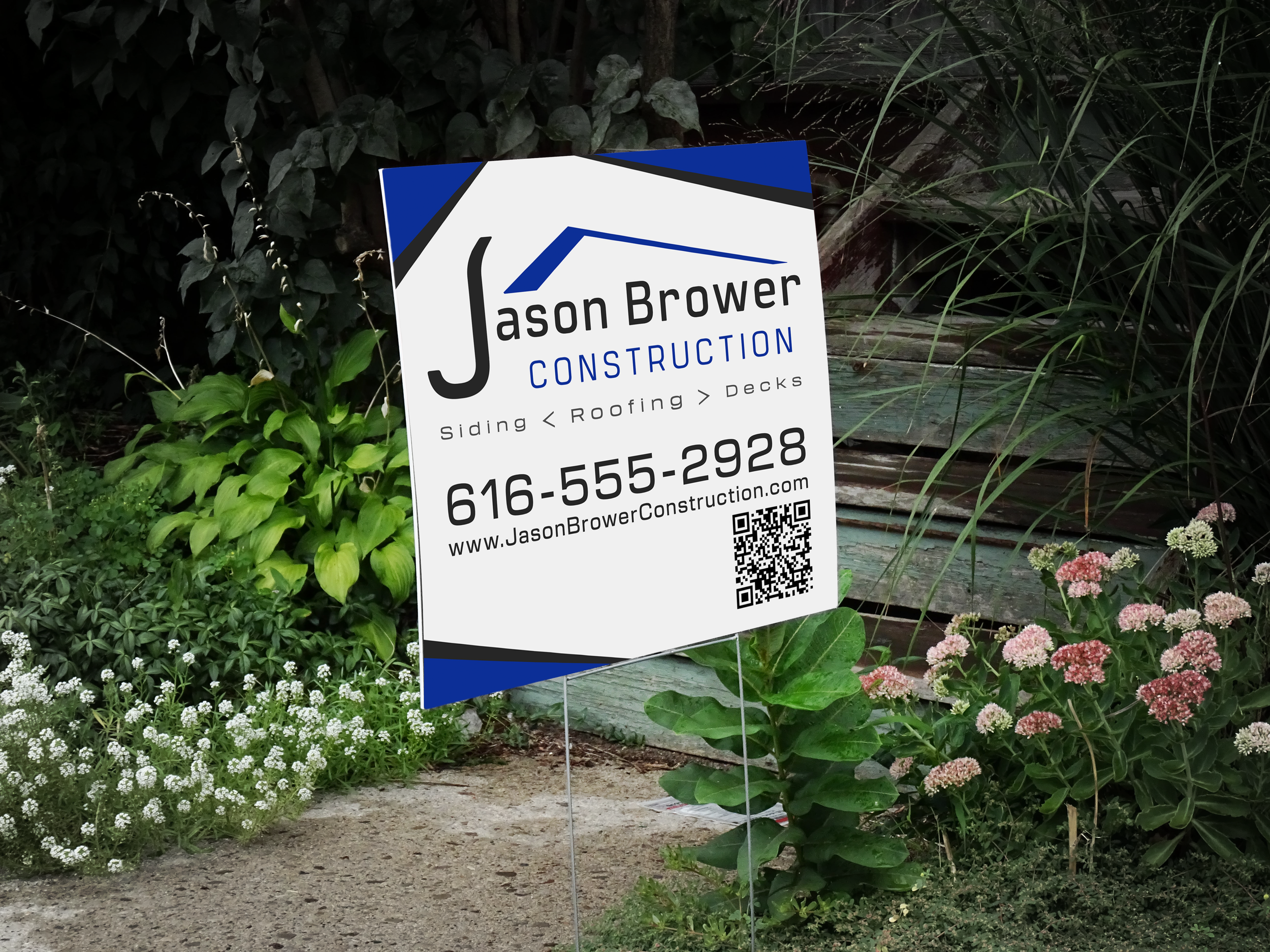
This project initially started with a request for a completely new logo design; nevertheless, following an initial consultation, the client ultimately determined that undertaking a full rebranding effort would be overly complex and time-consuming. They felt that instead, a more subtle refinement and adjustment to their existing logo would be a more practical and suitable solution for their needs. Although I had already initiated the redesign process, I ultimately chose to complete the project and include it in my portfolio here.
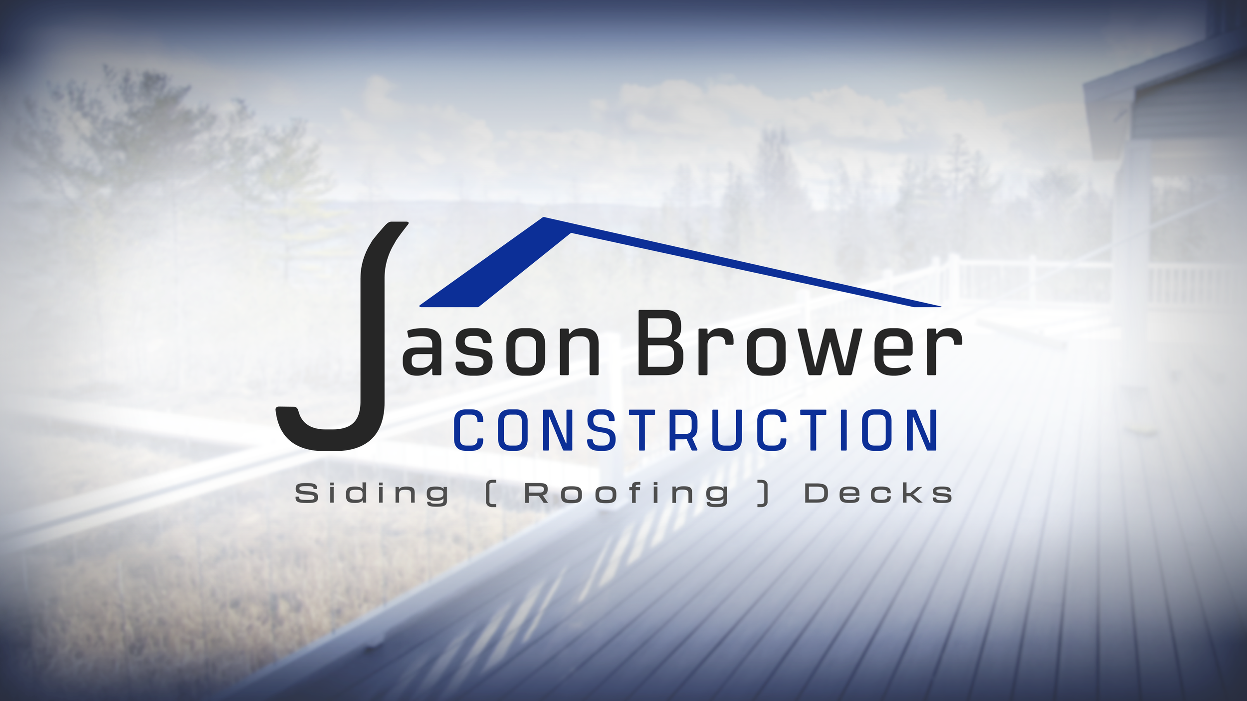
The core design element of the logo is a stylized wordmark that is intentionally crafted to visually resemble the outline of a hammer, thereby directly symbolizing and representing the construction trade. Through discussions with the company, it became clear that they wanted to place particular emphasis on their roofing services and clearly delineate their areas of expertise. To effectively address this need, we incorporated an asymmetric roof shape into the design, along with a subheading that prominently features the term "Roofing" enclosed within brackets to provide visual emphasis.