Exit Acumen
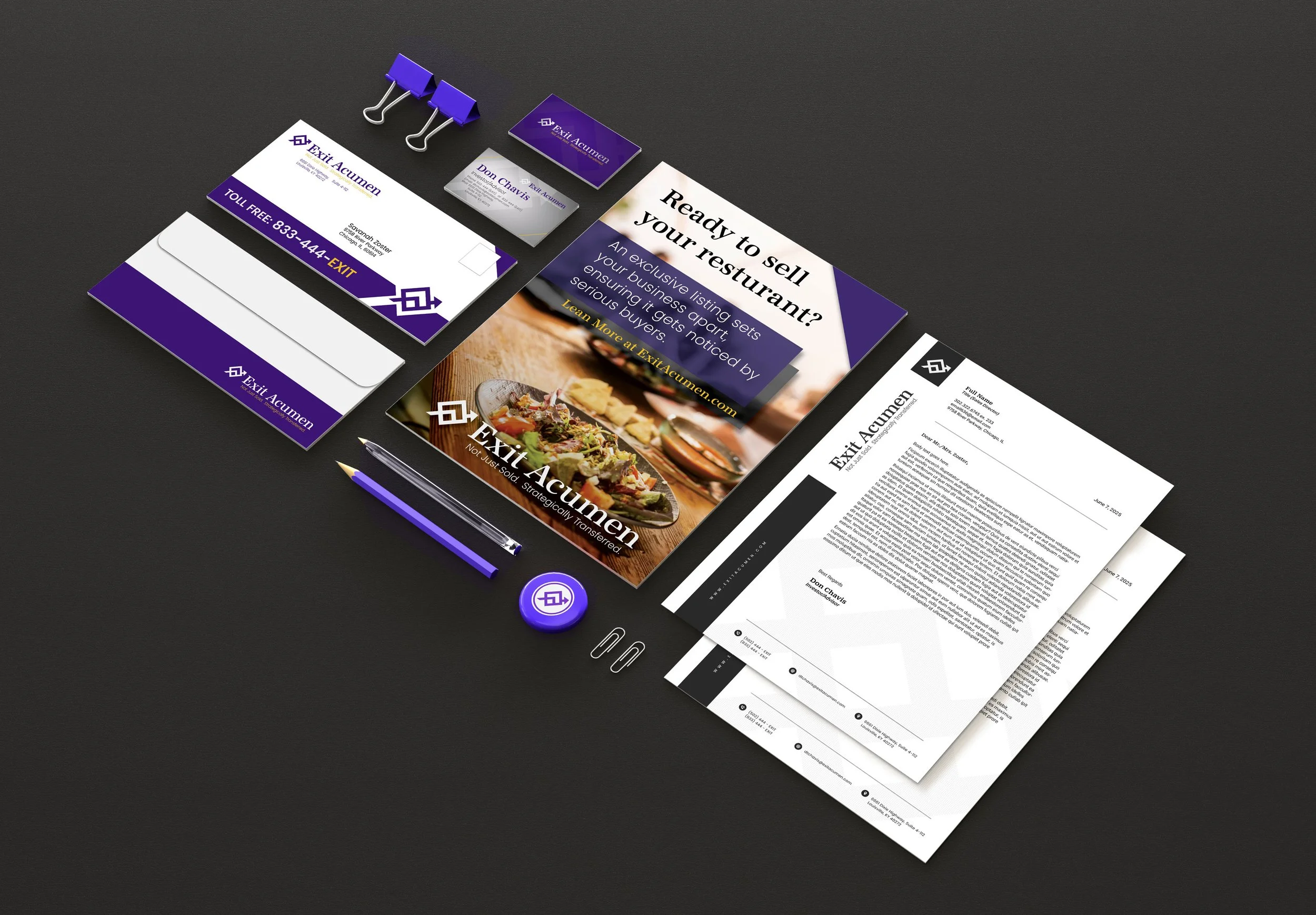
Exit Acumen, a new business brokerage, sought branding including a distinctive logo, professional letterhead, and eye-catching postcards for promotions. The client provided an original icon and, after exploring options, chose a refined version of it. The logo features a clean, professional serif typeface for clarity and a corporate look. The design incorporates a triangular shape symbolizing forward movement and dynamic progress, reflecting their role in guiding businesses through complex challenges.